
We are all ambassadors
With Luleå's place brand, we want to visually display the collective driving force that exists here – and we do it best together! Here, you'll find content that are free to use when you want to talk about your Luleå.
Luleå's place branding
The place brand is owned by all residents of Luleå because it is their collective initiatives that create the sense of place. And it's important for us to demonstrate this at every level. After all, the goal is for 1+1 to become 100,000 by 2040.
For us, it is the meeting of people, sound, light, scent, feeling, and experiences that create the sense of place – along with the simultaneous interactions within business and cultural life. Together, the sum becomes Luleå+YOU.
On this page, we want to create conditions for all residents of Luleå to use the concept+YOU based on the desires and needs present in the place. The place brand is shaped by all of us and can take as many forms as there are business owners, associations, and residents of Luleå.
%20IMG_3298.jpg)
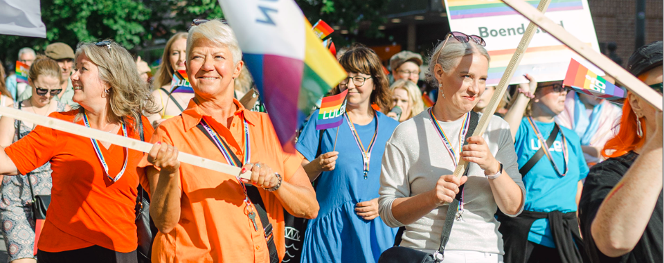
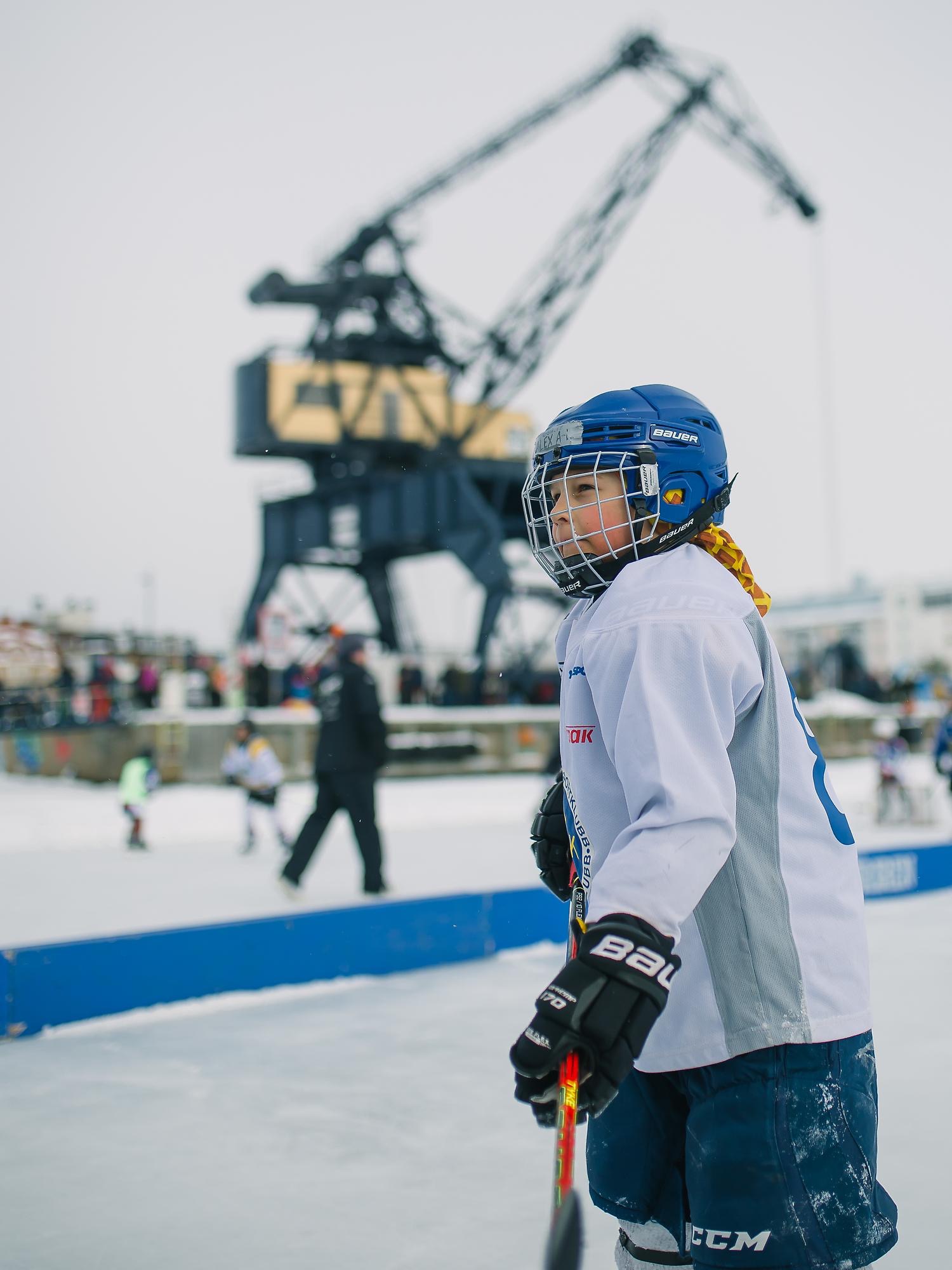
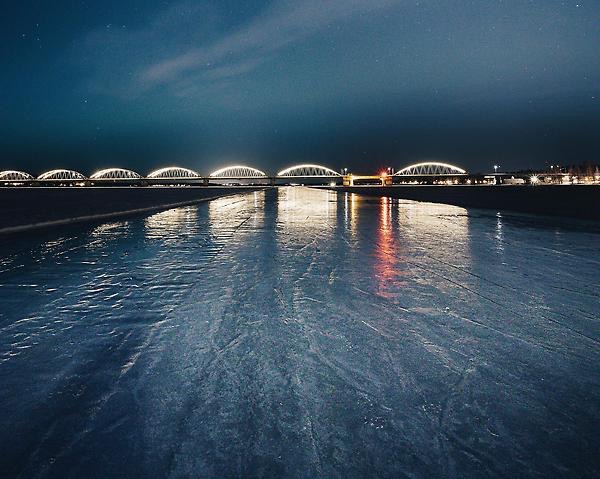
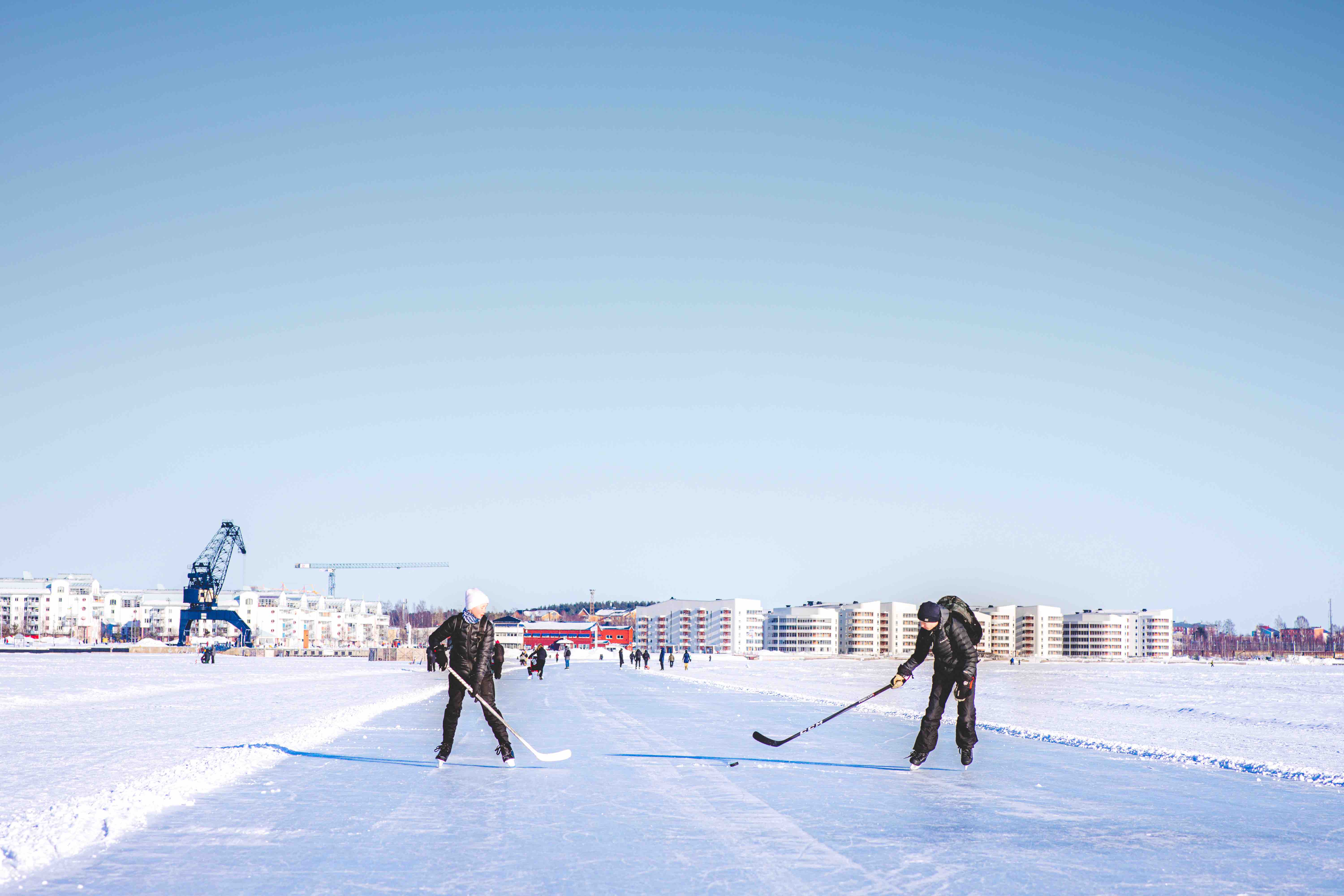
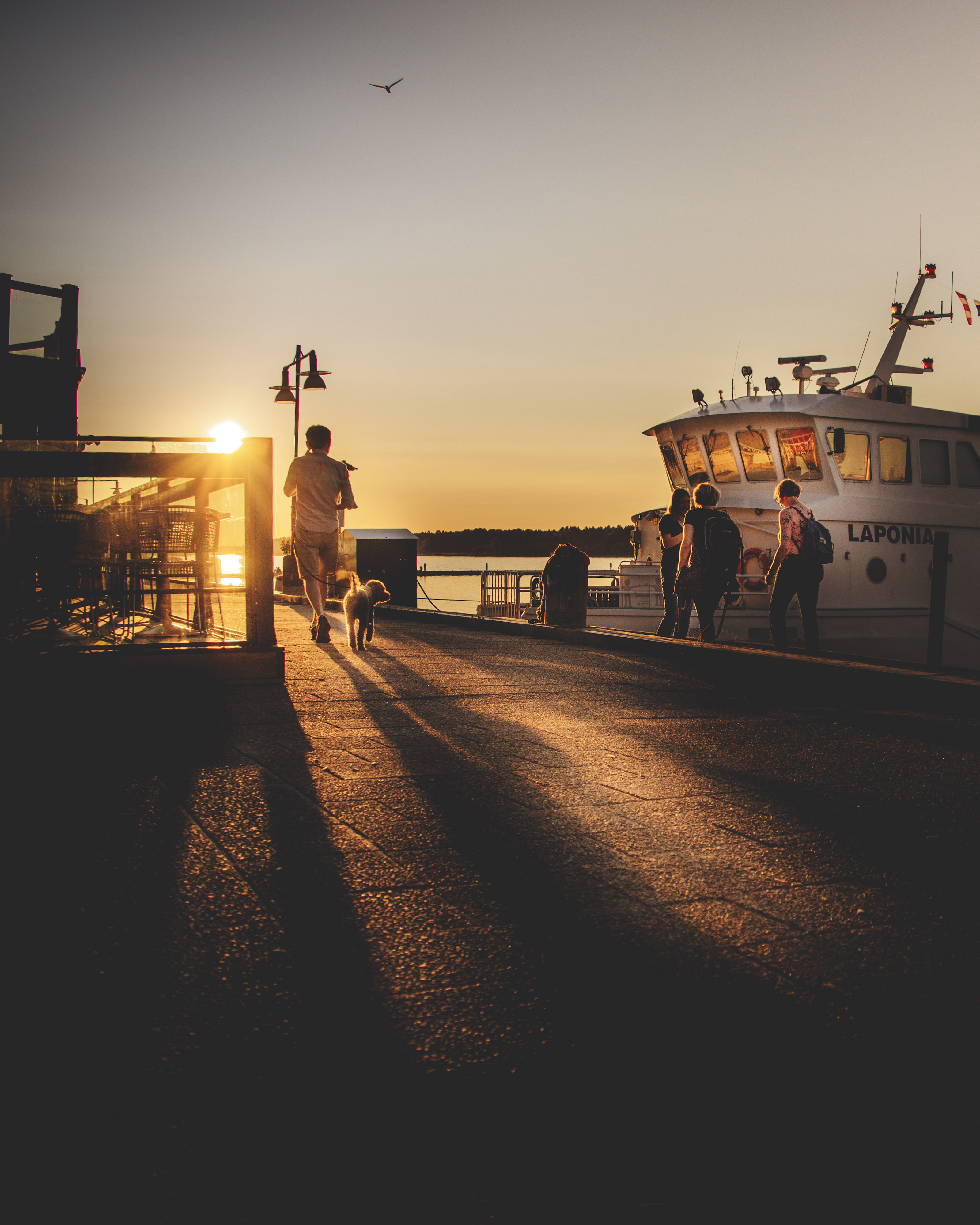
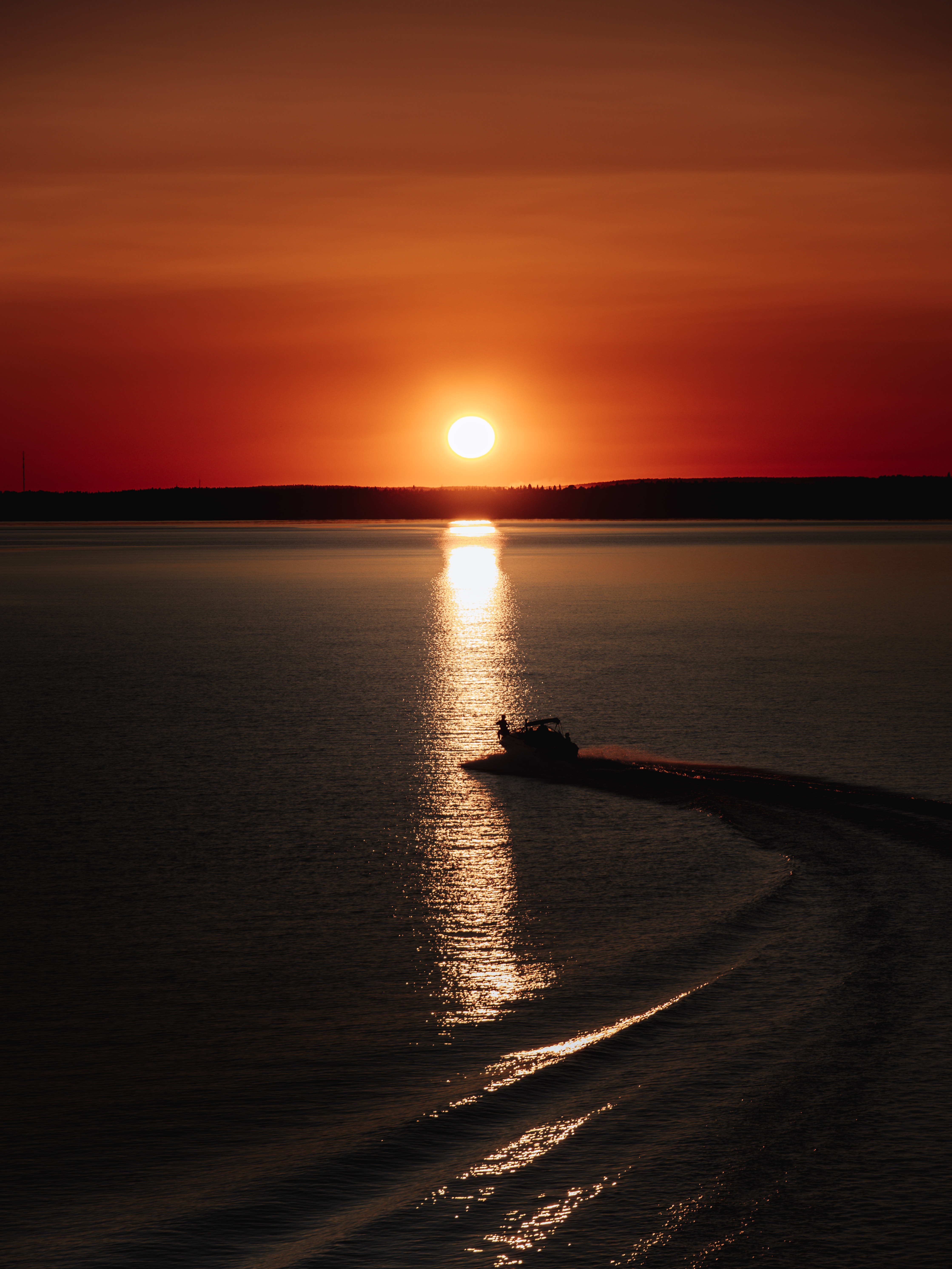
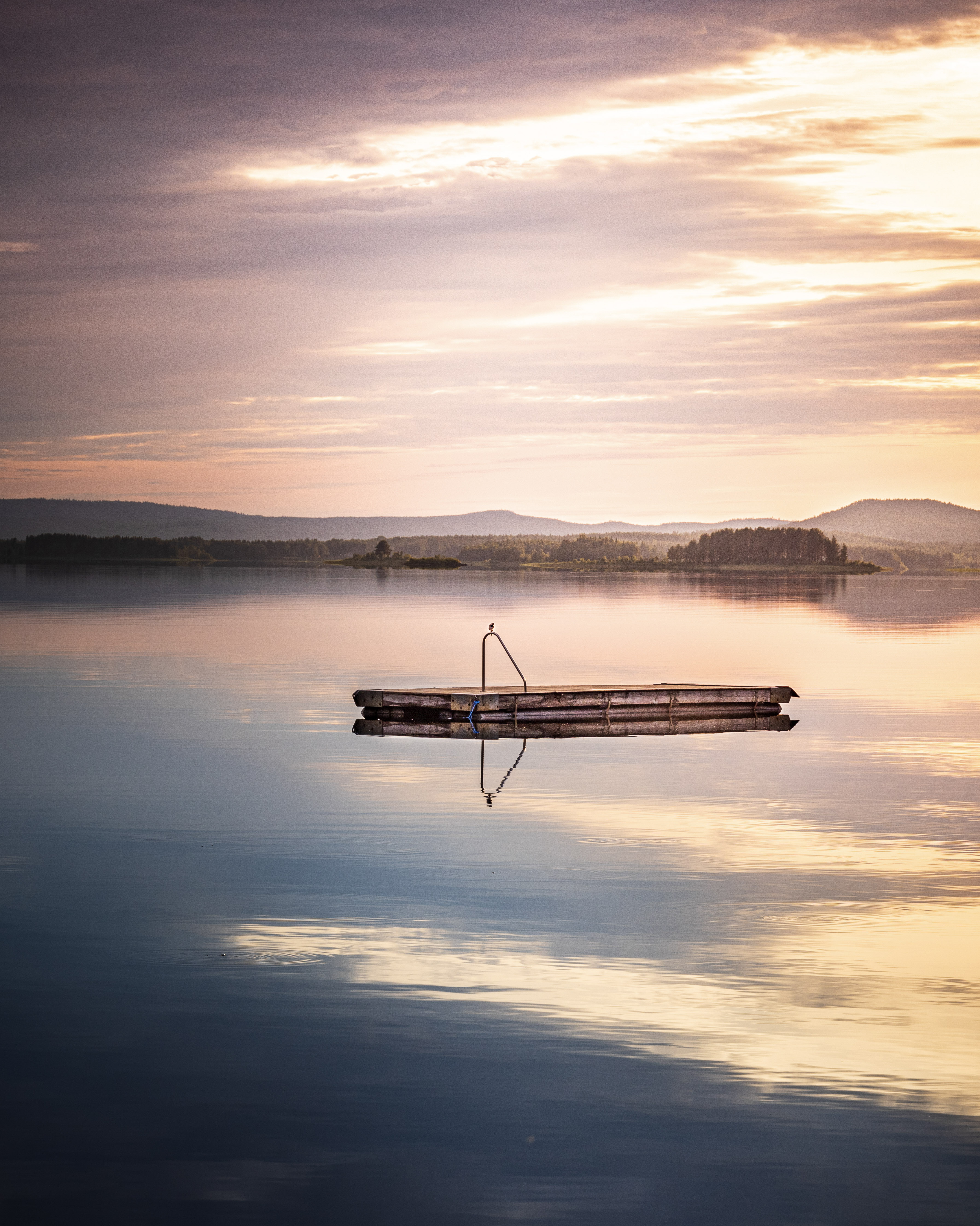
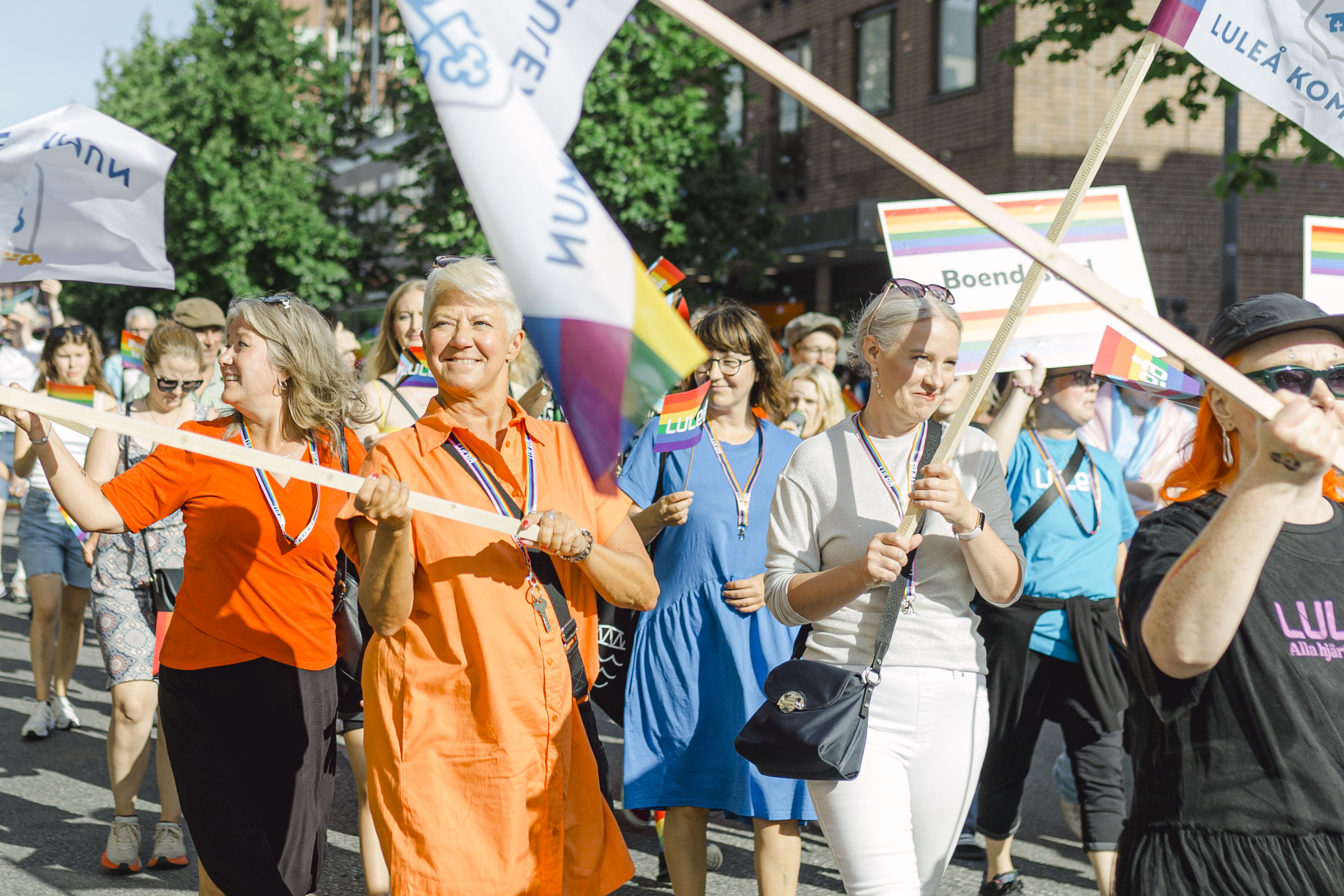
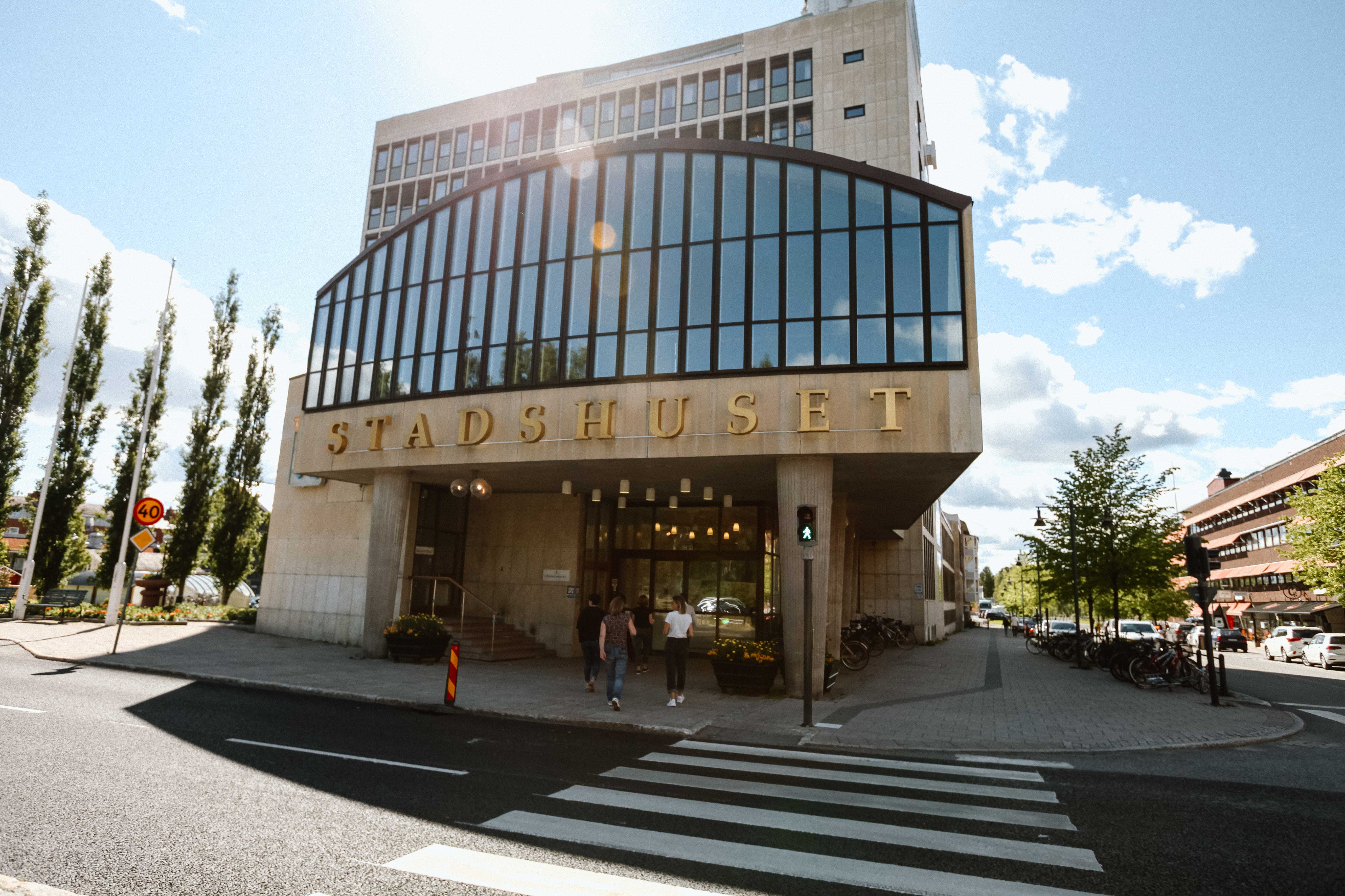
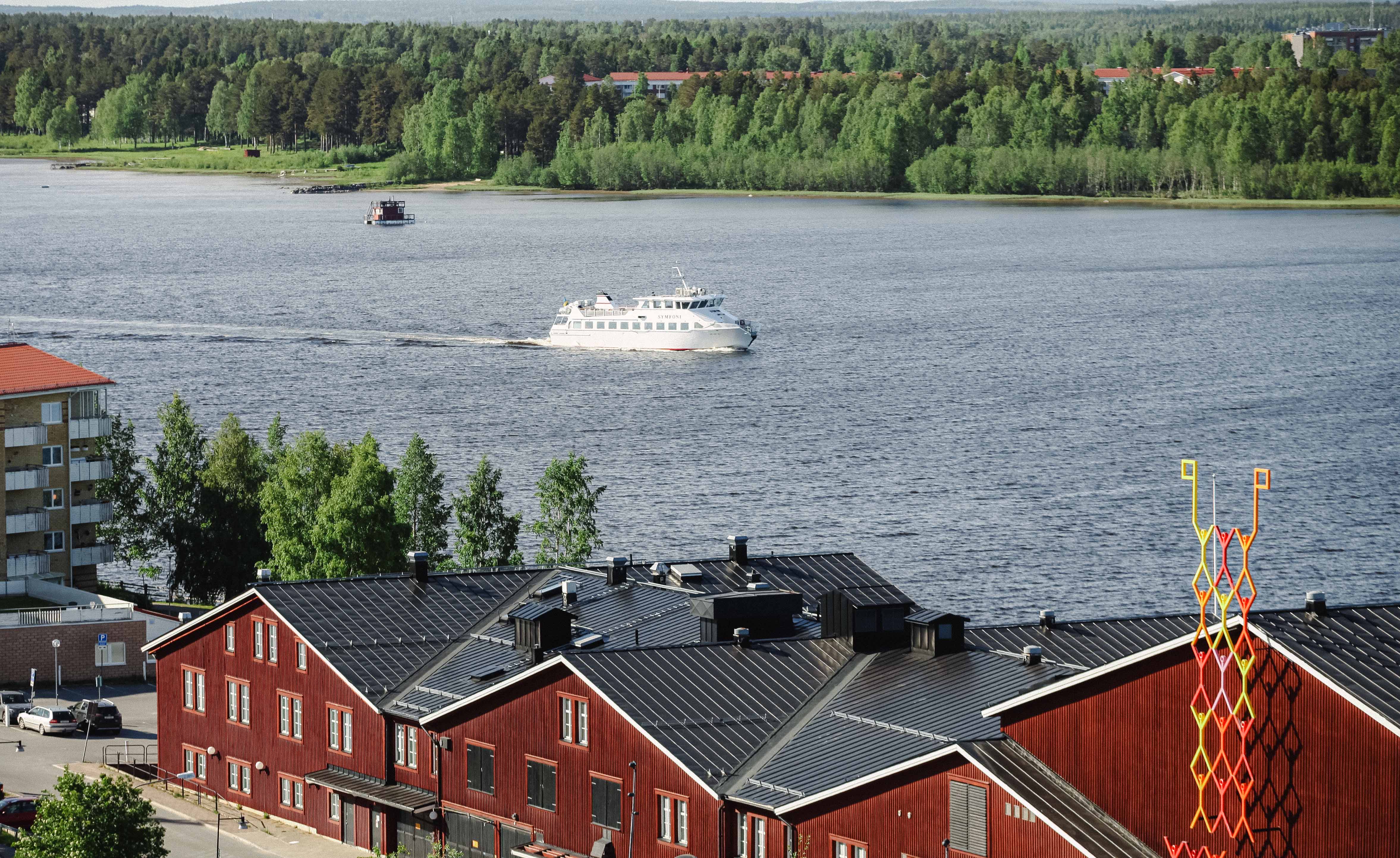
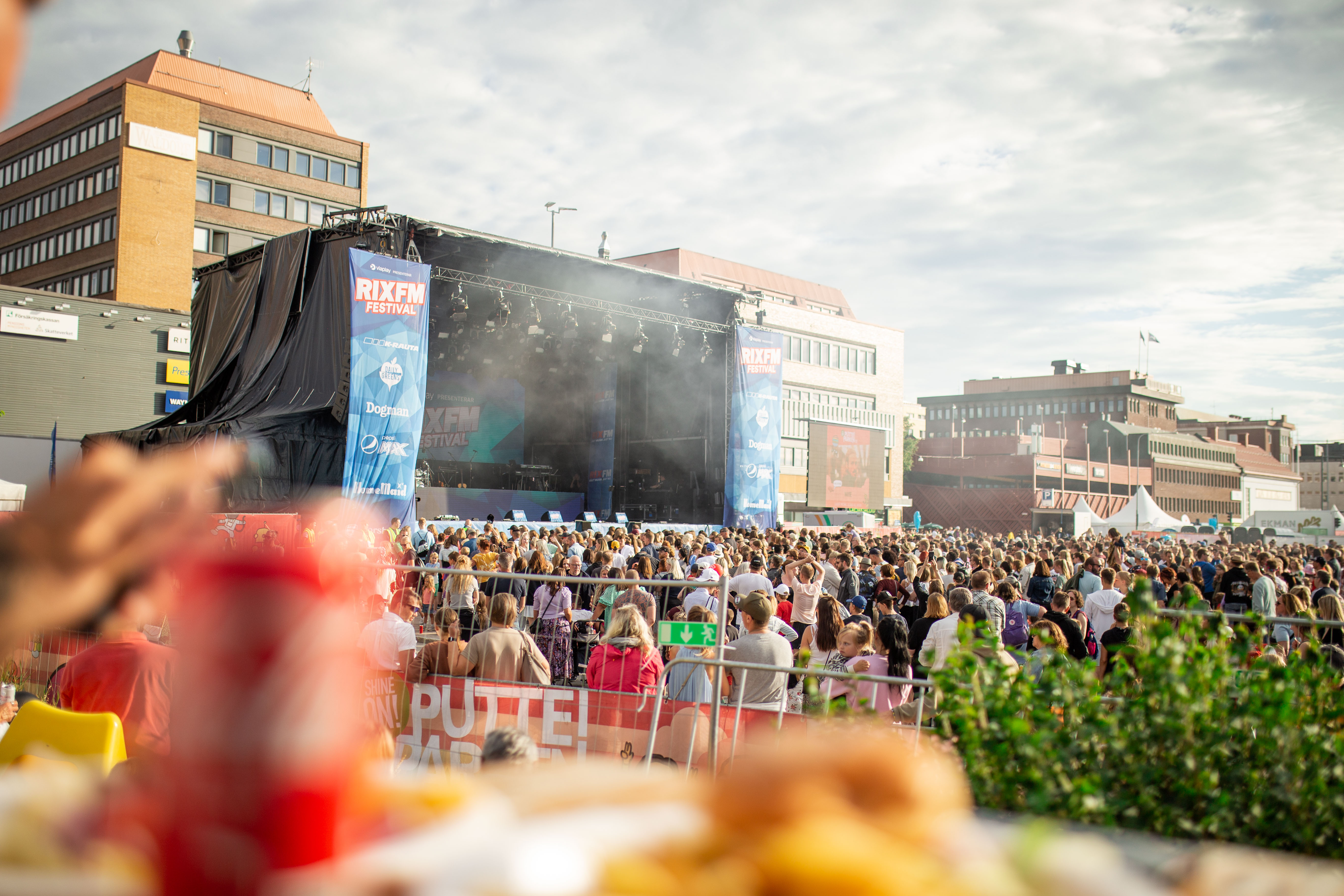
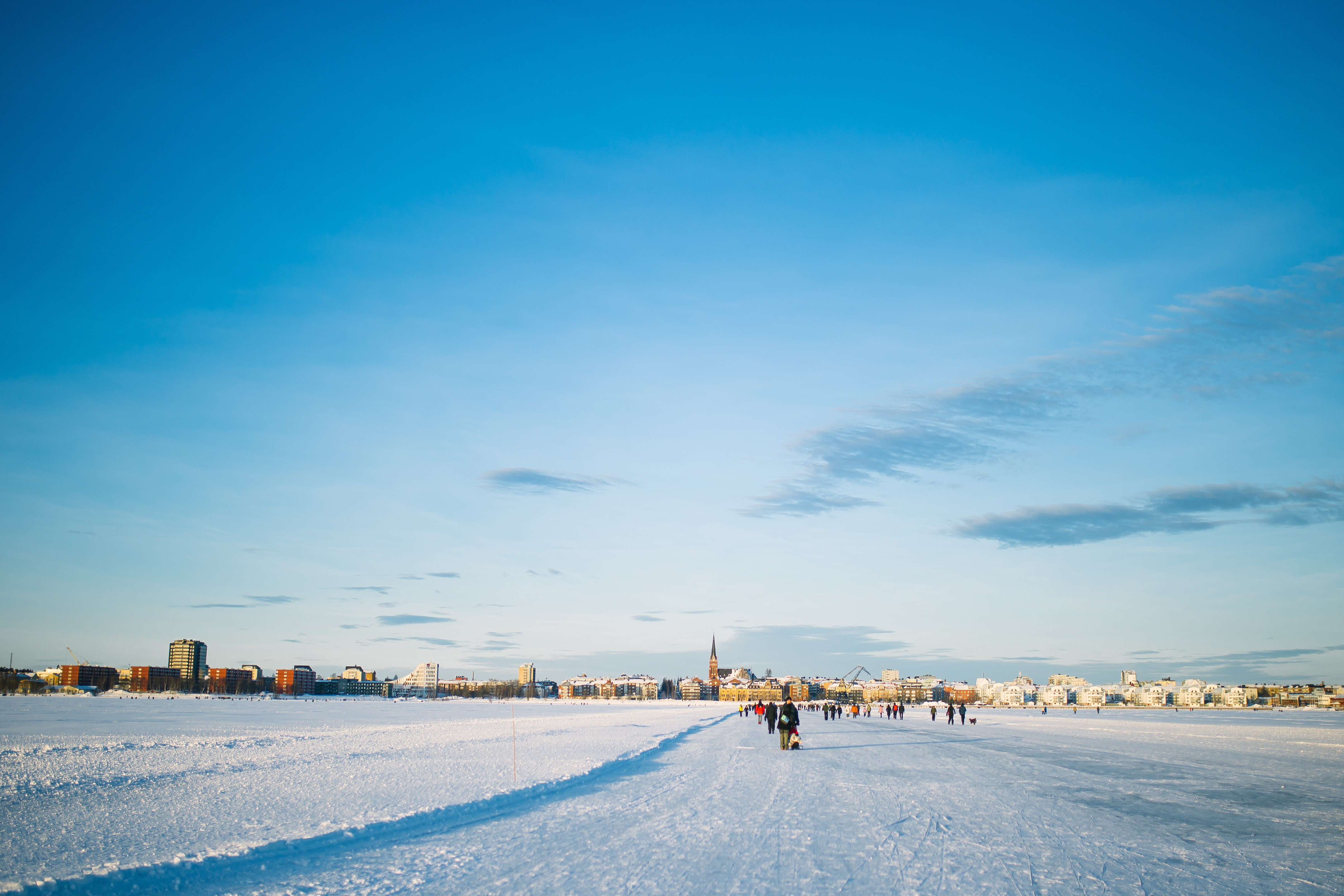
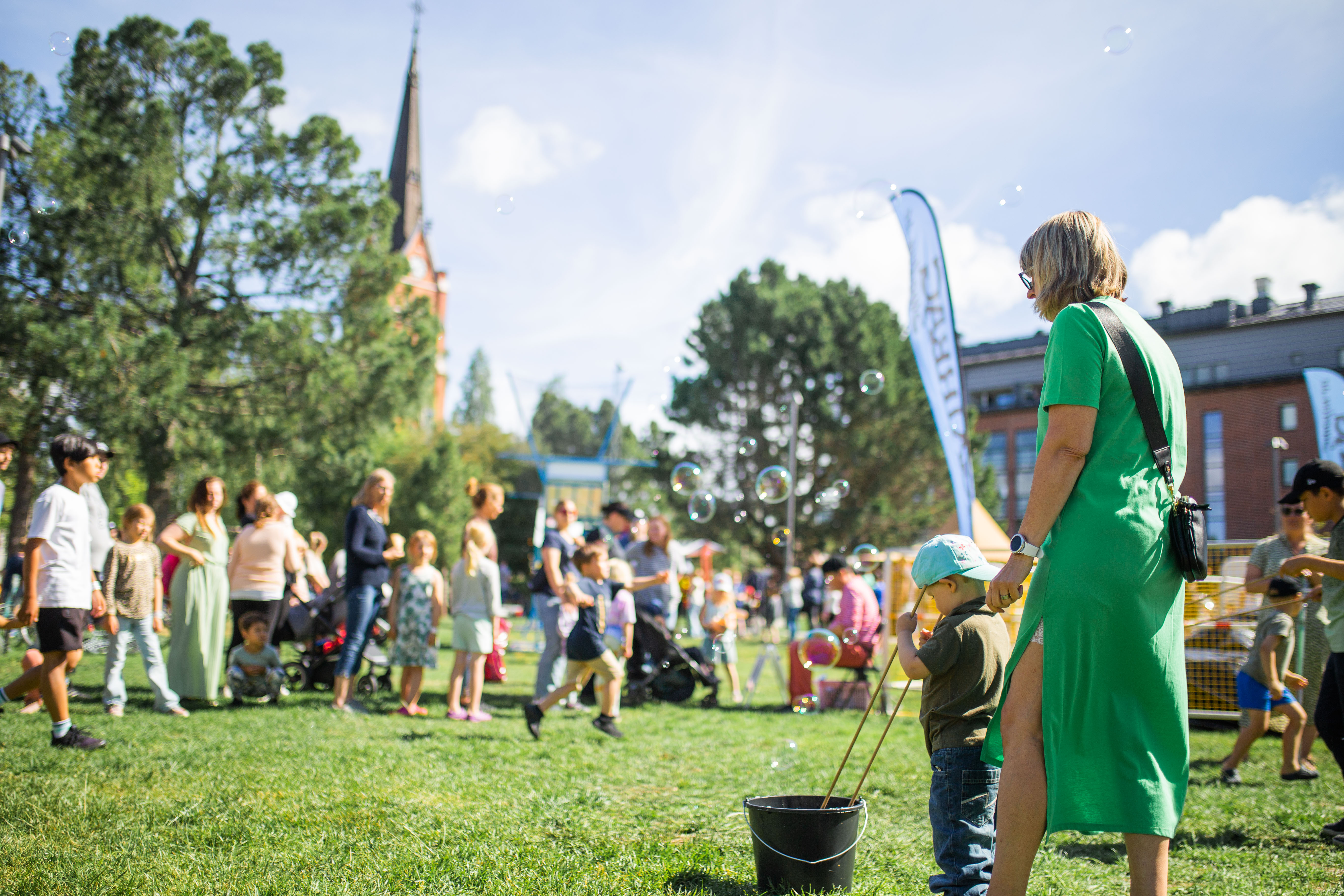
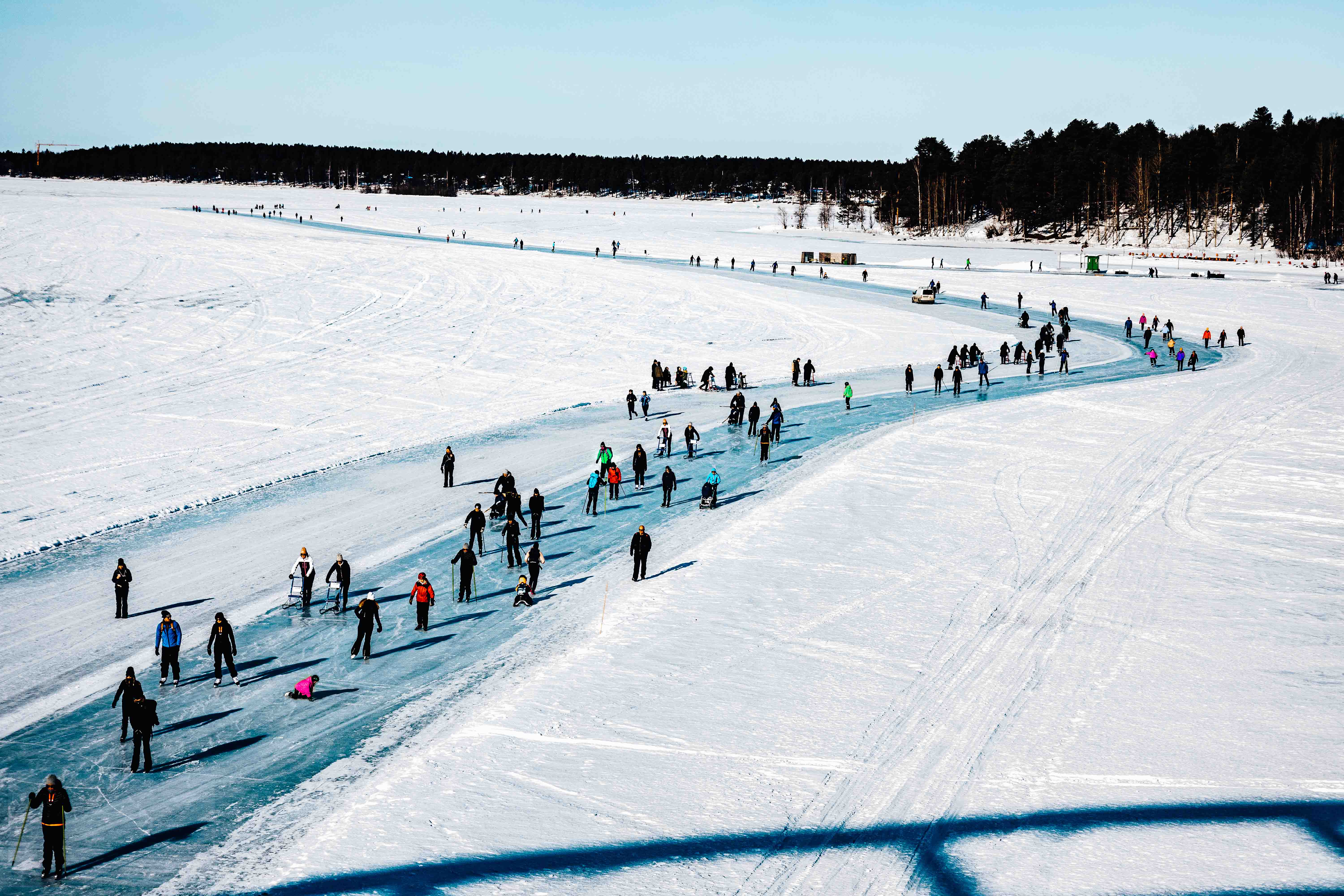
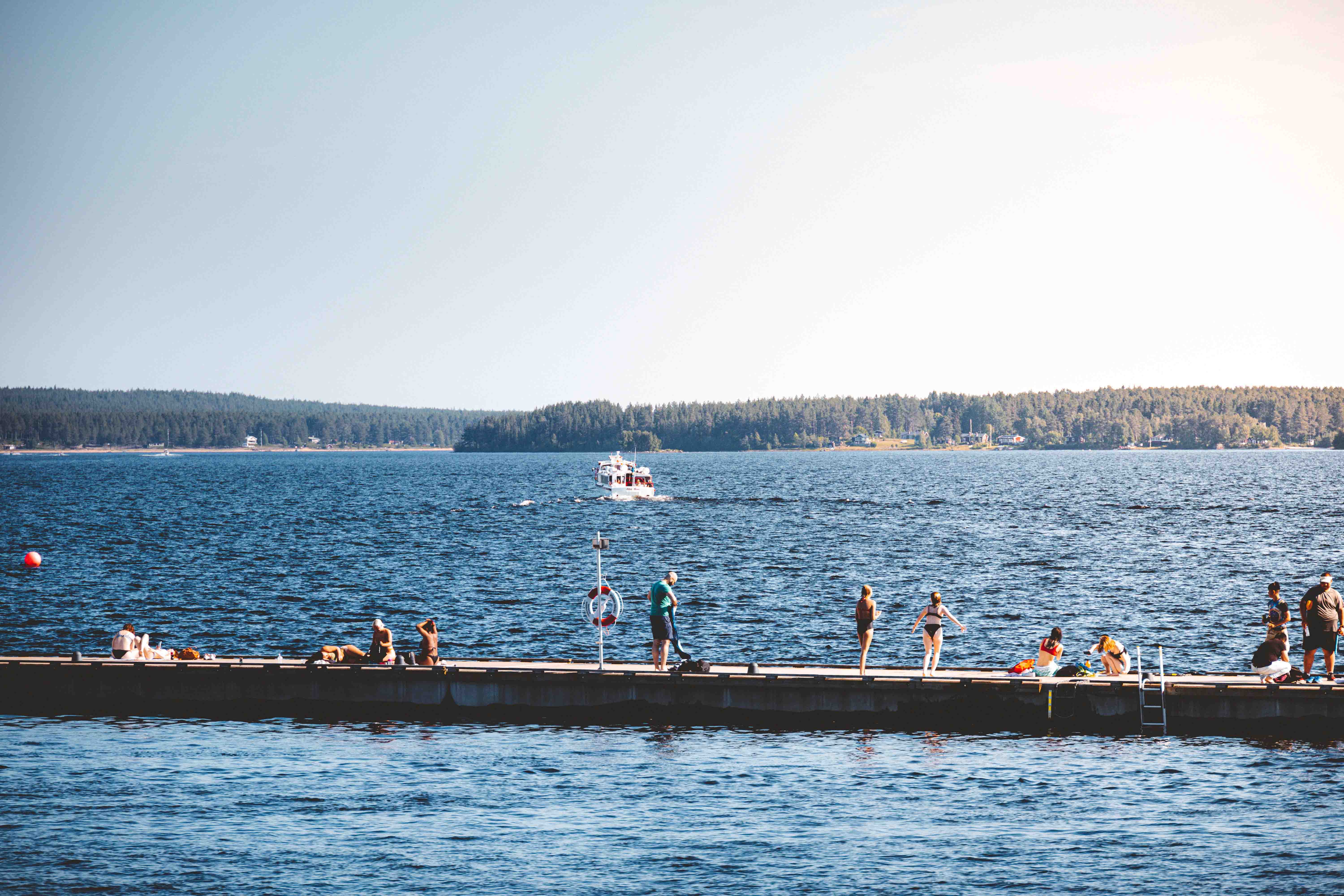
Image bank
%20Sk%C3%A4rmavbild%202023-10-19%20kl.%2016.38.48.png)
Movies and video content
%20(2)%20DSCF4866.jpg)
Material for presentation
%20(2)%20(2)%20ISBANAN_018-2.jpg)
Logo & typography
%20315-_H7A0481.jpg)
Place branding colours
%20(3)%20gfx-lulea.png)
Luleå+YOU
Image bank
Here in our image bank, you will find high-resolution images that are free to use to promote Luleå according to your needs.
The images should not be modified without the photographer's consent, and the copyright does not permit commercial use. However, they are free to use for editorial purposes.
To download: click on the image you want.


Movies and video content
Sometimes words aren't enough, so let's handle the talk in a brief video presentation about Luleå!
Därför valde jag Luleå
In our series "Därför valde jag Luleå," various individuals share how and why they chose to move to Luleå. Feel free to use these in the forums that suit your needs.
Would you like to see all the videos? Visit our YouTube.

Marcus Liwicki
On a summer day in 2017, Marcus Liwicki from Germany landed at Luleå Airport. Already, as the airport shuttle started rolling, Luleå had made a good first impression.
Mitsuo and Rickard
Mitsuo and Rickard moved to Luleå to live in a more open society. Through their YouTube channel, they showcase their everyday life in Luleå as a same-sex couple.
Emilia Olausson
Emilia moved from Stockholm to Luleå, and here, she created her own creative space. In Luleå, she runs her sustainable tattoo studio and expresses herself creatively through ink, music, and poetry.
Quinten Elpers
Belgian Quinten Elpers was captivated by the northern lights the first time he saw them in a picture. After a trip to northern Sweden, he wanted to return. Now he lives in a small community outside Luleå and has no plans to move.
Elin & Fredrik
Fredrik was born and raised in Varberg, but moved up north for guiding school. Today, both Elin and Fredrik work in the tourism industry and are loving it.
- There was something that clicked, that made me feel at home, says Elin.
Jolien Coens
Jolien Coens fell in love with Sweden a few years back after seeing the glistening snow and pink sunsets. After that, she decided to move from the Netherlands to Brändön.
The Friman sisters
After many years in Stockholm, the sisters Malin and Anna Friman, along with their families, chose to move back to their hometown. – It's a luxury to give my children the upbringing I myself have received, says Malin Friman.
Material for presentation
Here, we have prepared a PowerPoint presentation filled with material for those who want to talk about Luleå – ready to use as building blocks or inspiration for your own presentation. The images and videos on this page can also be seamlessly integrated into your presentation.
Examples of the pictures you can use.

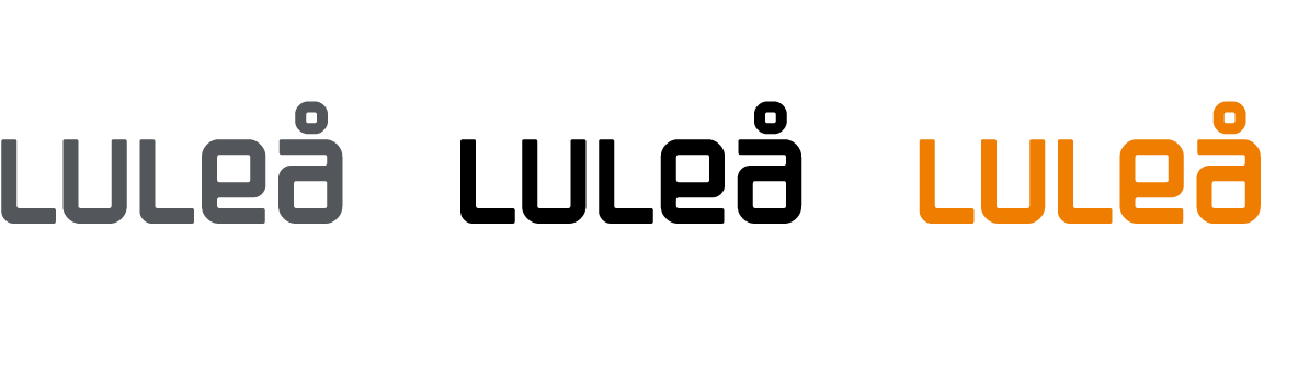
Logo and typography
Luleå's logo is the symbol we use when promoting Luleå. It is a well-established logo that Luleå kommun and other stakeholders have used for a long time. The logo can be used by anyone who wants to promote Luleå, as well as a part of communication in events such as congresses, recruitment, business activities, and establishments.
The logo is available in white, grey, black, and orange. We primarily use the logo in white whenever possible.
%20(2)%20lulea_grafisk_profil_logotype.png)
The logo in white against an image and on a coloured background should always ensure high contrast.
%20lulea_grafisk_profil_logotype_varianter.png)
- The grey version imparts a softer impression than the entirely black one.
- The entirely black version is employed when exceptionally high contrast is required.
- The orange logo is used sparingly, for instance, on signs along the ice road.
- The logo for the Luleå place brand should always be surrounded by clear space.
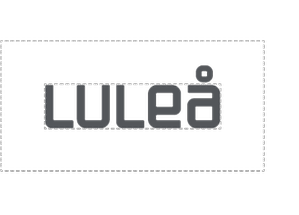%20lulea_grafisk_profil_friyta.png)
The logo may not be used as part of a logo for a company, organization, association, or society. For questions, please contact the communication unit of Luleå kommun at kommunikation@lulea.se.
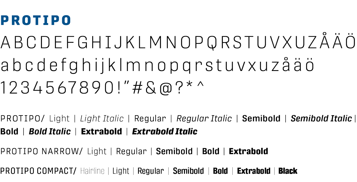
Typo for Luleås place brand
Protipo is a versatile and extensive font family with various cuts and styles that, together, create a cohesive, modern, clear, and diverse typographic design. Well-suited for both digital communication and print. Protipo is available via Adobe Creative Cloud for those producing communication within Luleå kommun.
%20lulea_grafisk_profil_typsnitt.png)
Choosing the font/style
See visual examples of typography application in the section "Visual Examples" in the graphic profile. Here are some general advice and tips:
- Establish a clear hierarchy between headlines, subheadings, and body text through size, style, and contrast.
- Maintain consistency in text sizes within each production, such as a printed material, a series of roll-ups, or an advertising campaign.
- Avoid using too many font styles in the same production.
- Keep headlines short and concise. When using all capital letters, consider letter spacing for better readability.
Checklist for good typography
- Headings often work best in bold styles like Bold, Extrabold, or Black. Narrow and Compact are space-efficient and provide a cohesive visual. Sometimes, trying a thinner cut/style is worth it for a softer impression, but don't forget to check the contrast.
- Subheadings can benefit from a bolder style, such as Semibold or Bold. Narrow or Compact can work well here too.
- Introductions can also use a bolder style, for example, Semibold.
- Image captions can be set in Protipo Light Italic or Protipo Regular Italic if they need to be distinguished from the body text.
- Body text should be set in Protipo Regular.
Colours
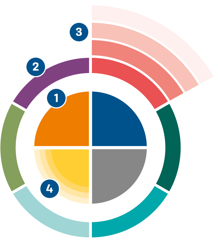
Profile colours are the colours primarily to be used in our design to convey our profile and create recognition.
Accent colours draw inspiration from the entire surroundings of Luleå, encompassing rural areas, urban environments, and nature. They complement the profile colours and create a visually broader and more multifaceted representation of Luleå.
%20(2)%20lulea_grafisk_profil_fargcirkel.png)
- The colours in the center of the circle are Luleå's primary profile colours.
- The colours in the outer circle are accent colours – read as secondary profile colours.
- Accent colours can be used in varying percentages based on the need.
- Aim to use the primary profile colours at full colour strength.
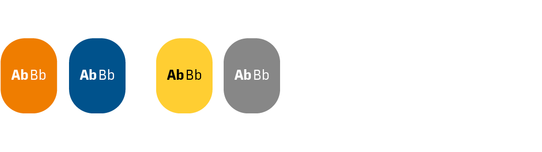
Profile colours

Profilfärg: Näringsliv
CMYK: 100/50/0/30
RGB: 0/82/140
HEX: #00528c
PMS 7692

Profilfärg: Midnatssljus
CMYK: 0/20/85/0
RGB: 255/206/50
HEX: #ffce32
PMS 116
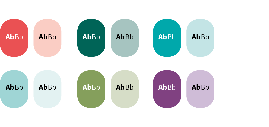
Accent colours

Accentfärg: Energi
CMYK: 0/60/100/0
RGB: 239/125/0
HEX: #ef7d00
PMS 151

Accentfärg: Stål
CMYK: 0/0/0/60
RGB: 135/135/135
HEX: #878787
PMS Cool gray 8

Accentfärg: Kulturliv
CMYK: 0/80/60/0
RGB: 234/81/83
HEX: #ea5153
PMS 1787

Accentfärg: Skog
CMYK: 100/10/60/42
RGB: 0/100/87
HEX: #006457
PMS 336

Accentfärg: Norrsken
CMYK: 85/0/38/0
RGB: 0/168/171
HEX: #00a8ab
PMS 3262

Accentfärg: Isväg
CMYK: 42/0/20/0
RGB: 159/213/213
HEX: #9fd5d5
PMS 324

Accentfärg: Grönska
CMYK: 45/9/69/23
RGB: 133/159/92
HEX: #859f5c
PMS 576

Accentfärg: Citypuls
CMYK: 50/80/0/20
RGB: 115/63/129
HEX: #733F81
PMS 7662
Colour palette
Our communication should be clear and accessible to everyone. Therefore, it's crucial to always strive for clear contrast and readability while ensuring that the design is appealing and enhances the message. Remember that accessibility is not solely determined by colour choices but also involves contrasts in terms of text thickness and size.
If you're unsure, use verification tools such as https://webbriktlinjer.se/riktlinjer/126-tillrackliga-kontraster/ to check for adequate contrasts.
Examples of contrast checking and readability in text
Profile colours
Accent colours
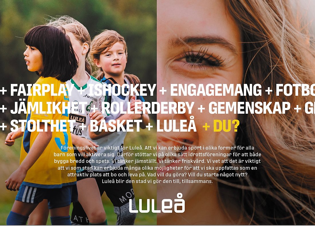
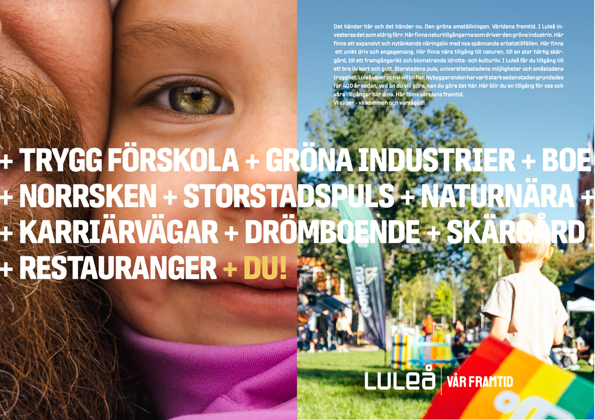
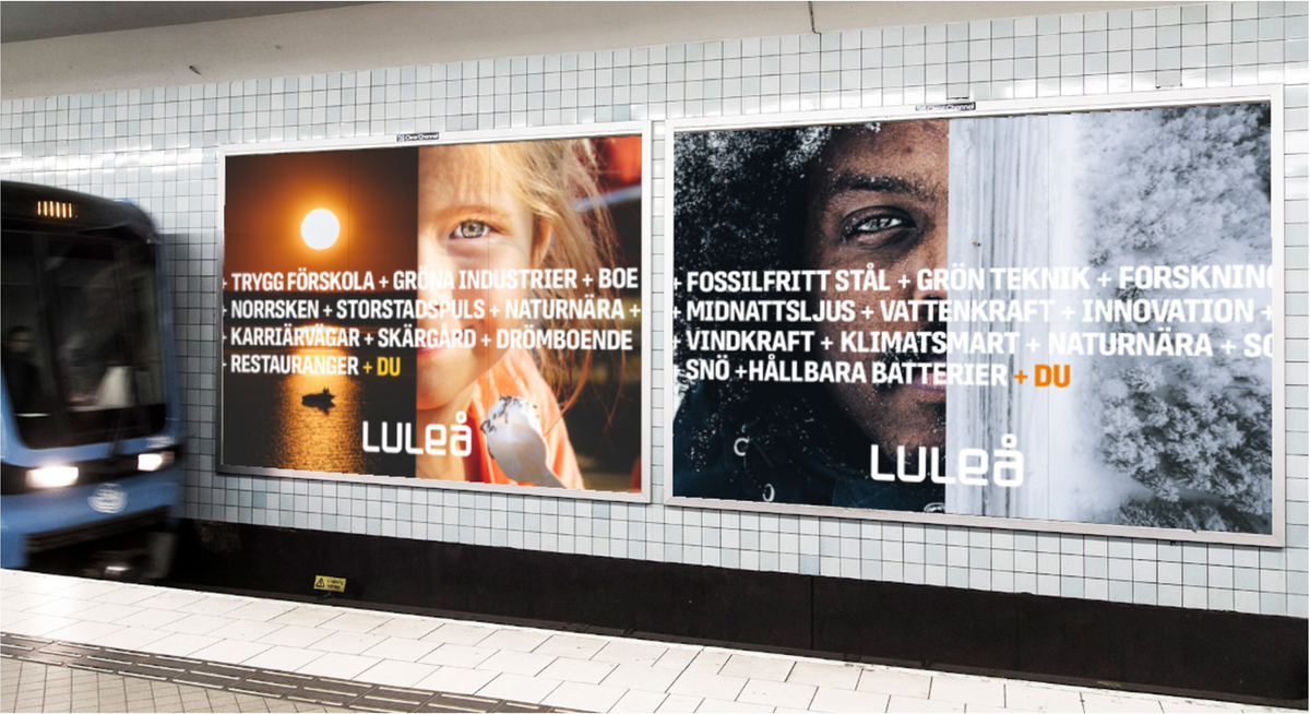
The concept +DU
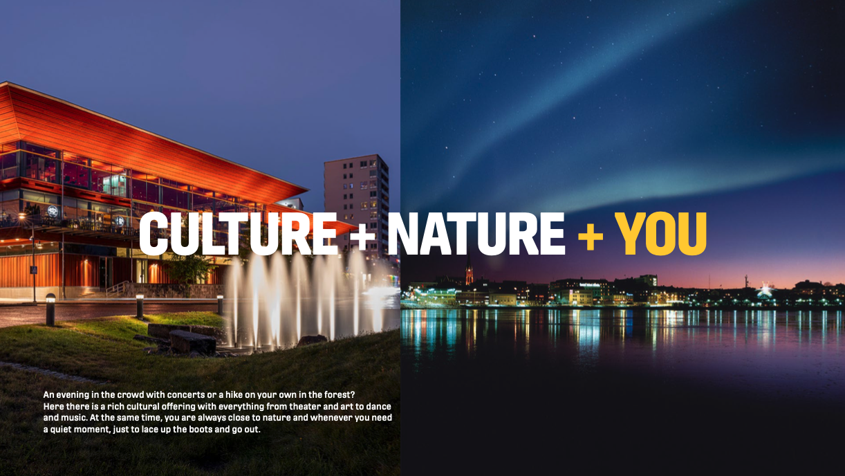
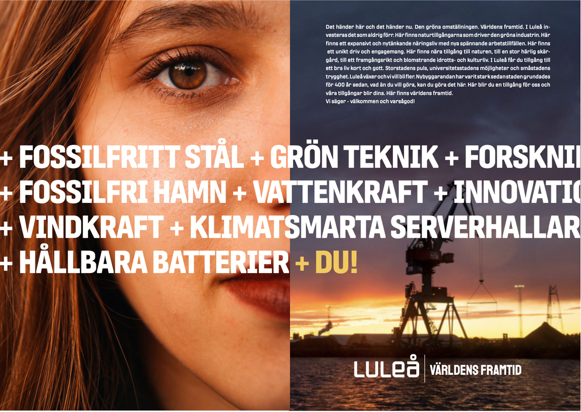
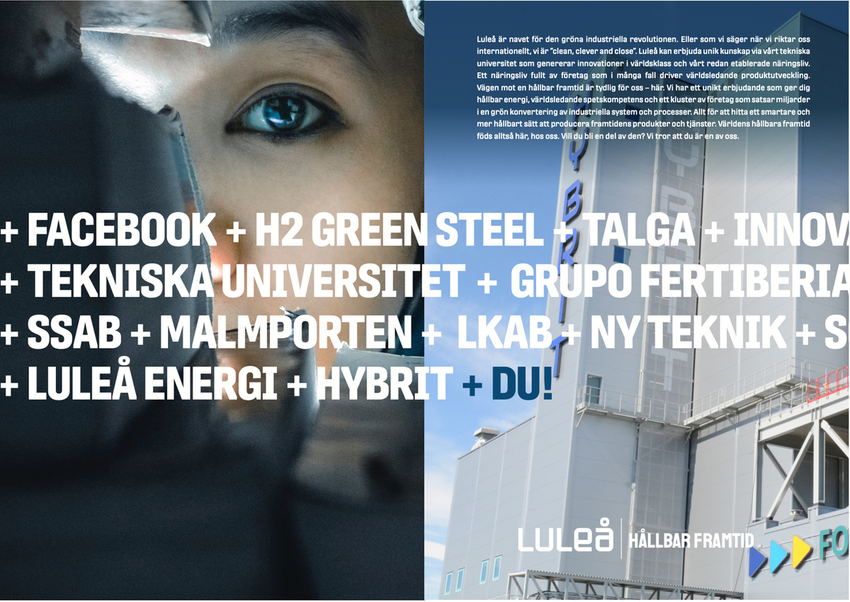
In Luleå, a multitude of contrasts and encounters coexist, and we aim to amplify this through our imagery. Contrasts can be sharp between seasons, neighborhoods, cultures, and in the business world. Here, you'll find both the midnight sun light and diversity, year-round – indoors and outdoors. The imagery allows you to play with the interaction between people and the environment. This can take shape through close-up portraits of individuals juxtaposed with expansive views, capturing both nature and the urban city, up close and in a broader perspective.
In practical terms, this means that by dividing the image space into two equal parts, we clarify the contrasts of the place. This is further emphasized by highlighting the place's assets and strengths. The words themselves vary for each of us, but the conclusion with +YOU aims to clarify that you are an asset and an equally important part of the place as everything else.
%20(3)%20lulea_grafisk_profil_koncept.png)
- We use the plus symbol (+) when listing the assets of the place to convey that they grow together, making the sum greater than the individual parts. Natural, innovative, and close are core values that permeate the plus words.
- The list always concludes with a +YOU. This signifies that the future is created by all of us together. You are an asset to the place, and when you move here, you become a part of all our assets.
Example
Here, you can see how the concept has been used for various purposes. Are you an active part of Luleå's business community? Of course, you are welcome to use the concept, and here are examples of how you can do that.
We are also incredibly proud of Luleå's rich community life! Therefore, we would be delighted to see local associations given the opportunity to use the concept.
Responsibility and contact
The communication unit of Luleå kommun has the overarching responsibility for coordinating Luleå's place marketing and ensuring the correct usage of the graphic profile.
If you are missing any materials, do not hesitate to reach out to us; we are happy to assist!
Contact
Communication Unit, Luleå kommun Email: kommunikation@lulea.se
Mailing Address
Luleå kommun
Communication Unit City Hall,
Rådstugatan 11 971 85 Luleå